


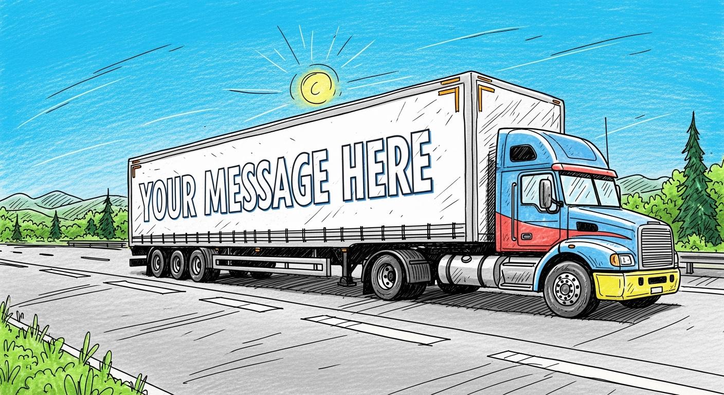
Many people pay attention to trucks wrapped with truck wraps. But you have less than a second for them to read your message. A moving vehicle is a fleeting advertising opportunity. So your goal for truck wraps designs is immediate comprehension, not complex artistry. Simplicity and clarity are your most powerful tools.
Key Takeaways
- Use bold, simple fonts and make letters big. This helps people read your message quickly from far away.
- Choose colors that stand out a lot from each other. This makes your words easy to see and understand.
- Keep your message short and put the most important words in the best spots on your truck. This helps people remember what you do.
Font and Sizing: The Foundation of Legibility
Your font choice and text size are the most important decisions in your truck wraps designs. They determine if your message is read or ignored. You must prioritize clarity over complex styling for your text to be effective on the move.
Choose Bold, Sans-Serif Fonts
You should select clean, bold, sans-serif fonts for maximum readability. Sans-serif fonts lack the small decorative strokes (serifs) found on fonts like Times New Roman. This clean look prevents letters from blurring at a distance. Research shows that bolding your text also enhances legibility and helps direct the viewer's attention. For example, the UK chose the sans-serif font Helvetica for its motorway signs because of its clarity from afar.
Consider these popular and effective font choices:
- Helvetica: A classic choice known for its simplicity and directness.
- Futura: Offers a clean, geometric look for a modern feel.
- Arial: A versatile and straightforward font that ensures clear communication.
Follow the 1-Inch per 10-Feet Rule
A reliable guideline for sizing is the 1-inch per 10-feet rule. This standard, supported by research from organizations like the United States Sign Council (USSC), ensures your text is visible from common viewing distances.
For every 10 feet of distance between your truck and the viewer, your letters should be at least 1 inch tall. A message seen from 100 feet away needs letters that are at least 10 inches high.
Applying this rule to your truck wraps designs is crucial for capturing attention on the road.
Give Letters and Lines Breathing Room
Proper spacing between letters and lines of text is essential. When letters are too close together, a condition known as tight tracking, they blend into each other. This forces the brain to work harder to identify individual characters, slowing down comprehension. For a message that needs to be understood in seconds, that delay means failure. Ensure your text is easy to scan so viewers can quickly extract key information like your company name and phone number.
Color and Contrast in Truck Wraps Designs
Color is the first thing a potential customer's brain processes. Your color choices can make your message stand out or disappear into traffic. Effective truck wraps designs use color and contrast to grab attention and ensure instant readability.
Master High-Contrast Color Pairings
You must choose color combinations that offer maximum contrast. High contrast makes your text easy to read from a distance, even at a quick glance. Research shows that up to 90% of snap judgments about products are based on color alone. Your color pairing sets the tone for your brand before a single word is read. For example, blue can convey trust, while red evokes excitement.
The most readable combination is black text on a white background. However, many other pairings work exceptionally well for signs and vehicles.
Consider these top-tier, high-contrast options for your design:
- Midnight Blue & Snow White: This pairing offers a contrast ratio similar to black and white but is easier on the eyes.
- Charcoal Black & Ivory: You can create a softer, more classic look with this gentle yet highly readable duo.
- Forest Green & Powder White: This combination feels natural and is highly effective, drawing strength from the red-green color axis.
- Navy Blue & Milk Coffee: This pairing provides a professional, "vintage CEO" vibe that remains legible in various lighting conditions.
Use Outlines to Make Text Pop
Your truck wrap may feature a photograph or a complex graphic as a background. Placing text directly on a busy image can make it unreadable, as letters may blend into different colored sections. You can solve this problem by adding an outline or a drop shadow to your text.
This simple technique creates a visual separation between the letters and the background. For instance, black text can disappear when it passes over a dark area of a photo. Adding a thin white or yellow outline makes the text "pop," ensuring it stays legible across the entire design. This is a critical trick for successful truck wraps designs that combine bold text with engaging imagery.
Message and Placement: The Strategy for Impact
Even the best font and color choices will fail if your message is confusing or placed incorrectly. You must think like a driver to determine what information goes where. Your strategy for message and placement will make or break your wrap's effectiveness.
Prioritize Prime Real Estate Zones
You should treat your vehicle like a piece of three-dimensional real estate. Each zone has a specific purpose. Strategic placement ensures your message is seen from multiple angles and distances, whether in motion or stopped in traffic.
- Vehicle Sides: These are your mobile billboards. Use this large, flat space for your company name, logo, and core service.
- Vehicle Back: This area is prime for calls to action. Drivers behind you have more time to read, making it the perfect spot for your website and phone number.
- Doors: The doors are excellent for framing your logo, making it a central visual element.
Create a Clear Information Hierarchy
You need to guide the viewer's eye to the most important information first. Effective truck wraps designs establish a clear visual hierarchy. Your logo and company name should act as the primary focal point, drawing the most attention.
Decide on the single most important piece of information a customer needs. Make it the biggest and boldest element on your wrap.
Secondary information, like a key service or phone number, should be smaller but still prominent. This balanced layout helps viewers process your message in seconds without feeling overwhelmed.
Stick to the 7-Word Rule
On the road, you have seconds to make an impression. A cluttered message is an unread message. You should follow the 7-word rule for your main message. This forces you to be clear and concise. Focus on who you are, what you do, and how to contact you. A simple message like "Smith Roofing • Quality Repairs • 555-123-4567" is instantly understood and far more powerful than a paragraph of text.
Your truck wrap's success hinges on four principles: simple fonts, large sizing, high contrast, and strategic placement.
The ultimate goal is to transform your vehicle into a mobile billboard that delivers a clear, memorable message instantly.
Apply these readability rules to ensure your truck wrap is a powerful marketing asset, not a moving blur. If you want to wrap your truck wrap with eye-catching wraps, you can choose the Ravoony custom wraps. Ravoony offer a lot of choices for you, like the Dolph Camo Wrap, the Marlboro Car Wrap, and even you can customize it specifically for you according to your ideas.
FAQ
What is the most important rule for truck wrap text?
Your message must be understood in 3-5 seconds. You should prioritize clarity and simplicity above all else for your design to succeed on the road.
How big should the letters be on my truck?
You can follow the 1-inch per 10-feet rule. For every 10 feet of viewing distance, your letters need to be at least 1 inch tall.
What colors are best for readability?
You should choose high-contrast color pairings. Black text on a white or yellow background offers the highest readability. Dark text on a light background always works well.


0 Comments